Matplotlib
Installation
1 | pip install matplotlib |
It is recommended to install matplotlib together with pandas (matplotlib will intall numpy at the same time). Then, start to plot:
1 | from matplotlib import pyplot as plt |
Loading data
pandas; CSV; date series data; real-time data
Plot types
Line plot
To plot a line plot, the API used is plt.plot.
1 | ages_x = [18, 19, 20, 21, 22] |
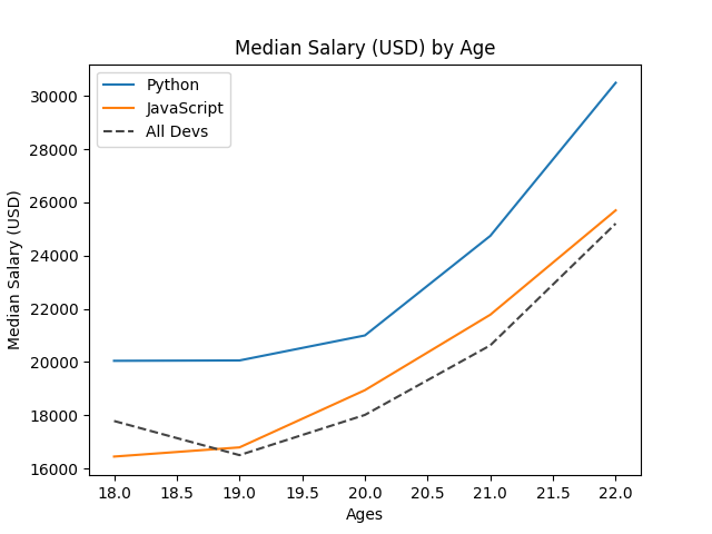
When running the code above, we get a line plot as shown. All line plots using the same object plt.plot will be drawn together. Once we wanna show the current plot, we should use plt.show(). The only two necessary arguments are x and y, that is, ages_x and py_dev_y (js_dev_y, dev_y).
plot.legend() asks pyplot to show the label of each line. There are two ways to add label for each curve, the way above and:
1 | plt.legend(['Python', 'JavaScript', 'All devs']) |
In general, the first way is better as we don't need to arrange the labels in the order of things being added to plot. However, no matter which one we choose, we must use plt.legend(), otherwise, the label will not be showed.
In addition to label argument, there are many arguments that let us format each plot. For examples, color, linestyle and etc.
- For
color, we can use the initial letter of color, like'r'or hex color values, like what we use above.- We can also use one parameter to set
color,linestyleandmarkertogether, like'b--', that iscolor='b'andlinestyle='--'.
plt.tight_layout() will automatically adjust the layout of chart to reduce the overlap of chart's x and y labels. It is useful when a chart is consisted of several subcharts. plt.savefig('plot.png') will save the plot as an image named plot.png in the specified folder (current folder by default).
Absolute path is required if you want to save the plot to a specified folder.
Other interesting setting:
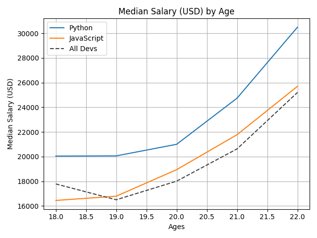
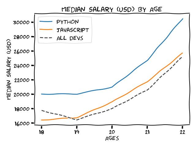
For the first one, use plt.grid(True). For the second one, use plt.xkcd(). By the way, plt.xkcd() should be placed before all the plt.plot() so that it can change the style of all line plots. The font family used in xkcd() is 'xkcd', 'xkcd Script', 'Humor Sans', 'Comic Neue' and 'Comic Sans Ms'. Windows has installed Comic Sans Ms. Therefore, pyplot will plot using Comic Sans Ms if other fonts can't be found. The font used in the second picture is Humor Sans. After installing a new font, delete the cache file .matplotlib.
Use
print(matplotlib.get_cachedir())to get the location of.matplotlib.
Apart from skcd(), there are many different styles in plt.style.
- Use
print(plt.style.available)to check the styles that can be used.- Use
plt.style.use('Yourchoice')to enable a style (seaborn-paper,fivethirtyeightandggplotare recommended).
Reference
Fill_between
To show the difference between two line plots or one line plot and a benchmark, plt.fill_between is rather useful. It can fill the area between two horizontal curves. It is actually a special type of "curve" so it can be formatted like other plt function:
1 | import numpy as np |
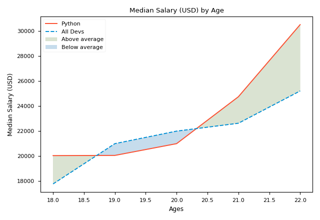
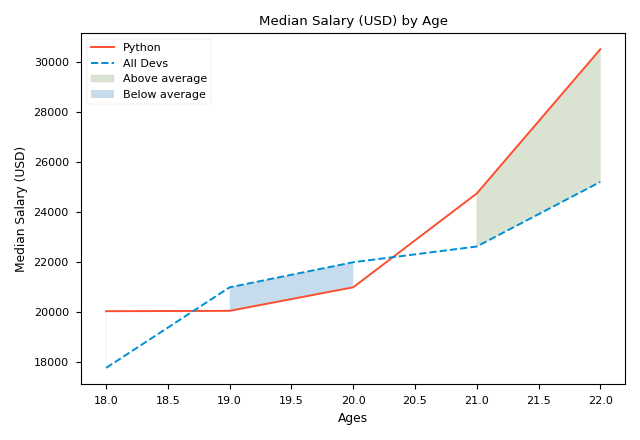
The first picture shows the result we get.
- The only two necessary arguments of
plt.fill_betweenisxandy1, that isages_xandpy_dev_y, which form the curvefill_betweenwill stuff; y2is 0 by default sofill_betweenwill fill the space between 0 and y1-x.y2could be a scalar (e.g. 0) or a vector. In the first chart,y2is a vector;alpha(0~1) is the transparency of the patch in the coverage area.1means opaque;whereis an important argument. It defines the scope or condition of filling. To makewherework, lists must can be compared, that's why we use the vector of numpy;interpolateonly works whenwhereexists. WheninterpolateisFalse, the filling area near the intersection ofy1andy2will be removed, like the second picture. It is recommended to setinterpolatetoTruewhen usingwhere.
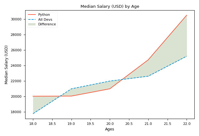
The following is a chart drawn by only using:
1 | plt.fill_between(ages_x, py_dev_y, dev_y, alpha=0.25, |
Reference
Bar chart
To draw a bar chart, what we need to do is to use plt.bar instead of plt.plot. It is legal to use plt.bar and plt.plot together as they can coexist. If we draw JavaScript and All devs using plt.bar while draw Python using plt.plot, we get the chart below:
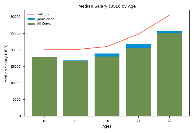
It seems that JavaScript and All devs have mixed together. To solve this, we should use numpy. This time, we draw three bar charts:
1 | import numpy as np |
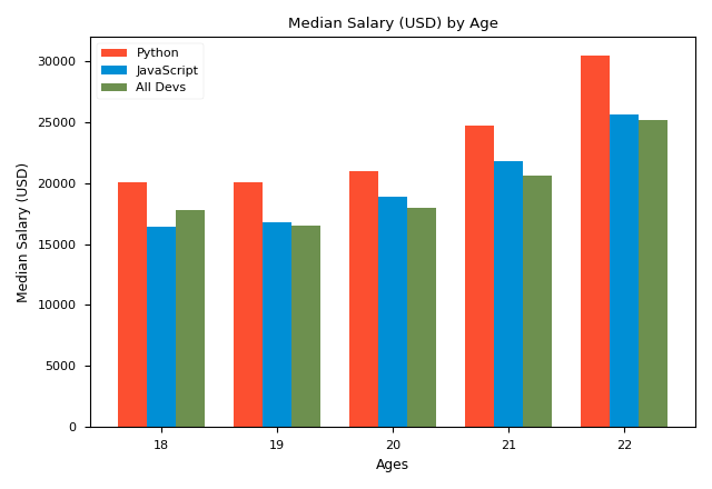
Then, we get the chart as shown. The reason why we use numpy is that numpy supports vector operations and it could be the parameter of plt.xticks(). x_indexes is actually a list. By adding or subtracting width, we put each bar of the certain bar chart forward or backward. Then, use argument width=width to control the width of each bar. For beauty, the value of width should be:
$$width=\frac{Distance\space between\space two\space scales}{Number\space of\space chart+1}$$
plt.xticks() is a function that modifies the scale and label of axis-x. ticks is the scales that will be shown on axis-x. For the chart we draw, it should be [0, 1, 2, 3, 4]. lables is the display values of the scales, which overrides the true values of scales. If you don't wanna show axis-x, you can use plt.xticks([]).
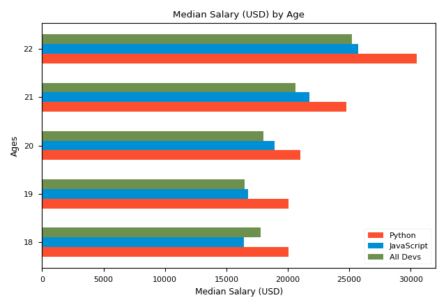
We can also draw horizontal bar chart using plot.barh(), like the chart as shown. However, the first parameter of plot.barh() is now vertical axis, that is axis-y, and the second is axis-x. Therefore, we should use plot.yticks() to modify the scale. Besides, the width of bar is now the height of bar, so the argument is height=xx.
Reference
Pie chart
If the number of data is less than 5 and we want to display their proportion, the pie chart is a good choice. To draw a pie chart, the function we use is plt.pie:
1 | plt.style.use("seaborn-v0_8-paper") |
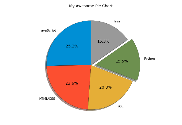
The picture as shown is the pie chart we get. For plt.pie, the only necessary argument is slices, that is the data. Others are formatting arguments:
explode: List, which specifies the fraction of the radius with which to offset each wedge;shadow: Draw a shadow beneath pie;startangle: The angle by which the start of the pie is rotated (counterclockwise);autopct: A string or function used to label each wedge. If string, it should start with%;wedgepros: A dictionary, which modifies the features of wedge;- ...
Reference
Stack plot
Stack plot (area plot), which shows the change of items over something (e.g. time) as well as the quantitative relationship between them, is a very useful kind of chart, especially when the sum of items is constant. To draw a stack plot, what we use is plt.stackplot
1 | plt.style.use("seaborn-v0_8-paper") |
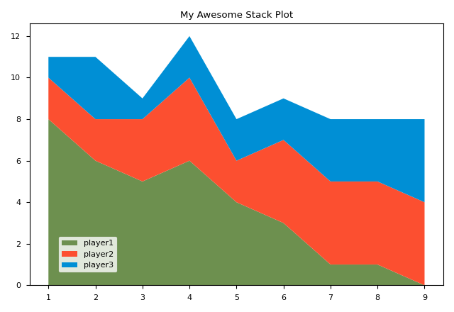
The picture shows the stack plot we get. Compared to other charts, it is quite simple and does't have many things to format. One thing worth noticing is plt.legend(loc(0.07, 0.05)). It means putting the tab to the position that 7% from left and 5% from bottom.
Reference
Histogram
A histogram is a chart that plots the distribution of a numeric variable's values as a series of bins. Each bin covers a range of numeric values. It is clearer than the bar chart when the range of x is too large. To draw a histogram, what we use is plt.hist
1 | plt.style.use('seaborn-v0_8-paper') |
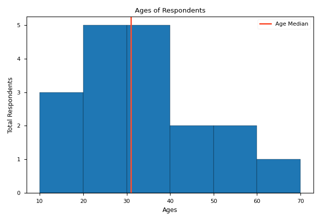
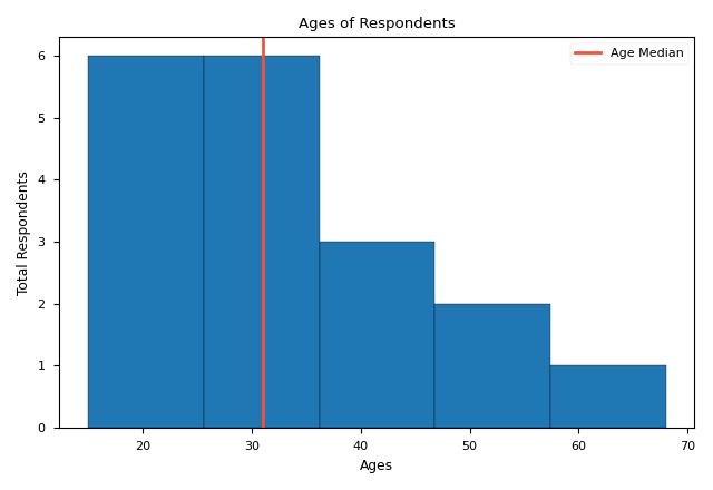
The only necessary argument of plt.hist is x, that is ages. bins is an important argument, which defines the range of each bin. It could be a scalar (the second picture) or a list (the first picture). If it is a scalar, its value represents the number of bins. The range of each bin is decided by plt.hist itself. Others are just some formatting arguments. plt.axvline which draws a vertical line, is often used with histogram.
Reference
Scatter plot
The scatter plot can show the correlation of two parameters intuitively. However, in addition to the quantitative relationship, pyplot can show more information. To draw a scatter plot, what we use is plt.scatter.
1 | plt.style.use('seaborn-v0_8-paper') |
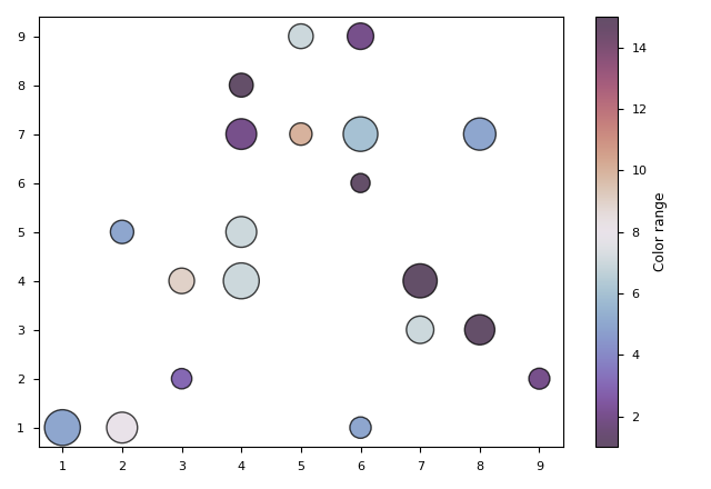
x and y are the only two arguments we need. Other formatting arguments are almost the same as other plots':
edgecolor: The cloer of marker edges;linewidth: The linewidth of marker edges;alpha: Transparency of color;- ...
However, the color (c) and size (s) of the scatter plot are slightly different from others'. Compared to other plots, c and s in the scatter plot can be used to show extra information. The value of c or s doesn't count, but their quantitative relationship counts. That is, the size of c and s list is equal to the number of scatters and their relative quantitative relationship reflects the shades of color and the size of dots. For c, a kind of colormap (e.g. 'twilight_shifted') is needed to determine the gradient colors.
plt.colorbar returns a bar that shows the gradation range of colors and the values represented by different colors. If the range of x or y label is too large, we can use xscale or yscale to scale the label. We can also use marker to change the form of scatter.
Reference
Data types
Time series data
pyplot also allows us to draw plots with time series data. To do this:
- Store data in the form of
datetimein python; - Plot using
plt.plot_date; - Format the form of displaying
datetimedata (optional).
1 | from datetime import datetime |
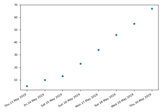
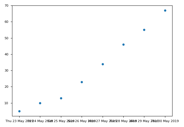
plt.gcf() and plt.gca() are notable. plt.gcf() returns the current figure. autofmt_xdate() will make xlabel more readable (the first picture uses autofmt_xdate() while the second doesn't). What's more, we can also change the form of displaying date by passing a DateFormatter object to set_major.formatter. This object should conform to the python datetime format.
Reference
Real-time data
animation module in matplotlib is used to draw plot with real-time data. In the following code, random and count are just for producing random data to simulate real-time data.
1 | import random |
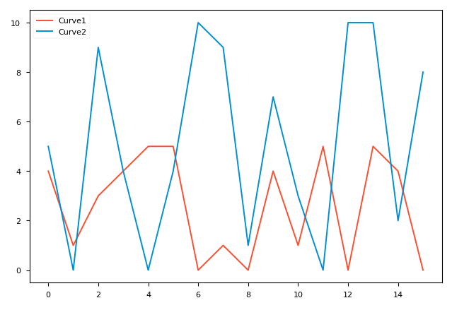
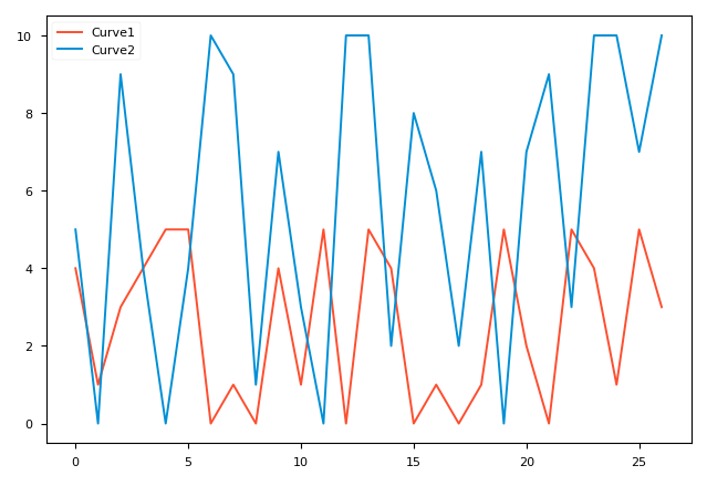
These two figures were drawn at 16 and 26 seconds respectively. In FuncAnimation, only plt.gcf() which is the figure we want to plot and animate which is the plotting function, are needed. interval (in milliseconds) defines FuncAnimation's time interval for calling animate. animate is the most important part. It is actually a function of drawing a kind of plot. Because the data it uses changes whenever it is called, the figure changes accordingly. Pyplot realizes this by drawing a totally new figure that overwrites the previous figures. Therefore, we should use plt.cla() to delete the previous figure, otherwise the color of figure will change continuously.
Some bugs may occur if you use pycharm as your IDE:
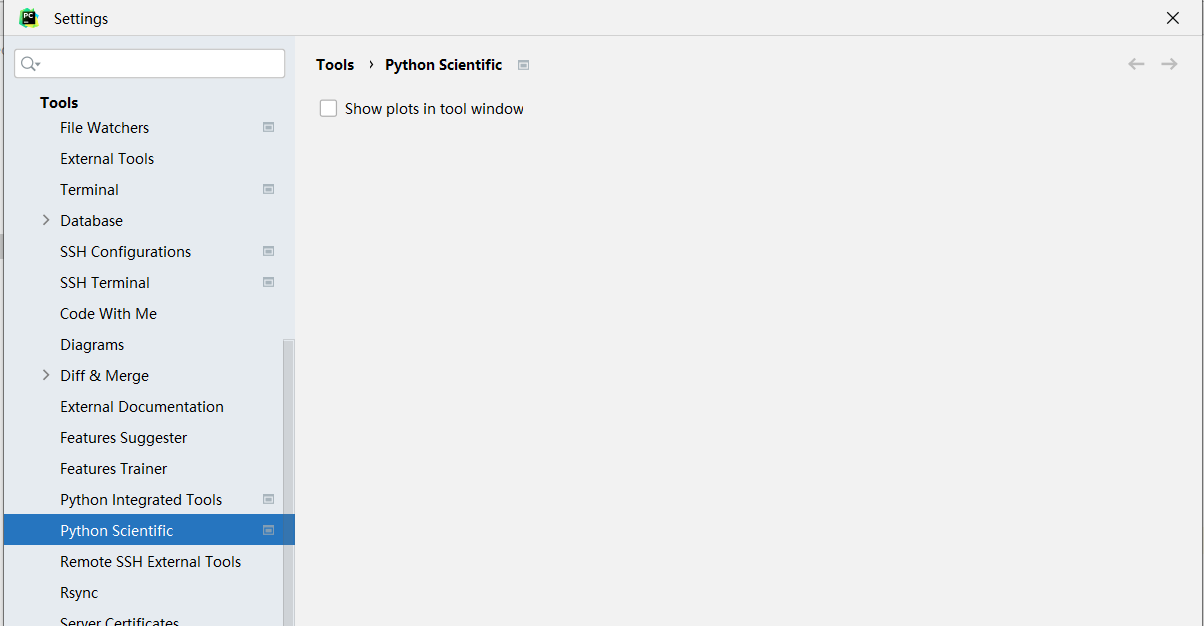
- Can't display the figure: To solve this, untick
Show plots in tool window:- User warning: frames=None: To solve this, add
cache_frame_data=False.
Reference
Subplot
In general, a figure draw by Matplotlib contains the following components:
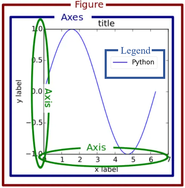
where a figure is a canvas, a axes is a subgraph object. A figure can contain several axes. In the above, we only use one figure with one axes. To draw more complicated figures, we can use plt.subplots. plt.subplots returns a figure object and several axes objects. With axes objects, we can plot several subgraphs in one figure. With figure objects, we can produce multiple figures:
1 | plt.style.use("seaborn-v0_8-notebook") |
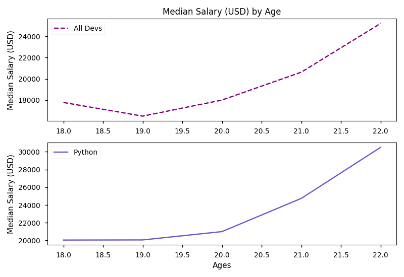
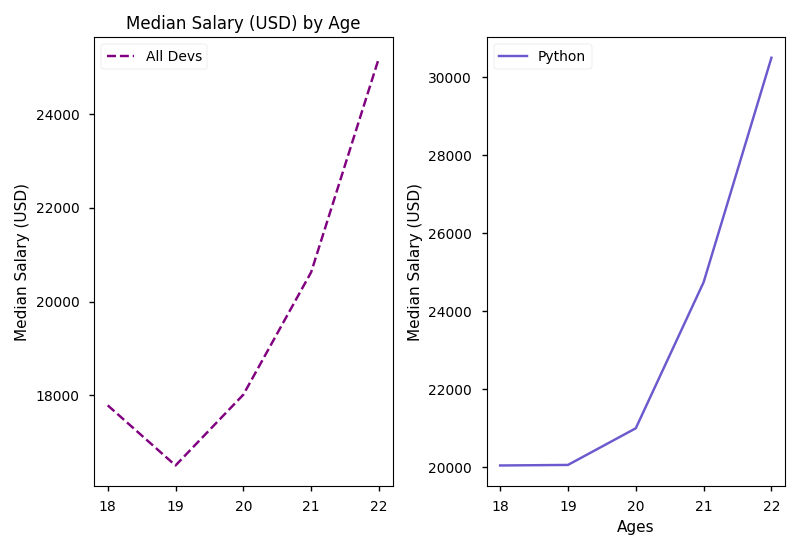
We can plot using ax1 and ax2 as plt. However, plt.title, plt.xlabel and plt.ylabel should be replaced with ax.set_title, ax.set_xlabel and ax.set_ylabel. If we want to modify figure, like saving a figure, we should use the figure object we get which is the same type as plt.gcf().
The arguments of plt.subplots define the layout of subgraphs. If we set nrows=2, ncols=1, we get the first figure. If we set nrows=1, ncols=2, we geet the second figure.
The second return value of
plt.subplotsis actually a matrix. Therefore, we can simply use:
and visit ax1 and ax2 using
ax[0]ansax[1]. A more complicated example:
2
3
# is equal to
fig1, ((ax1, ax2), (ax3, ax4)) = plt.subplots(nrows=2, ncols=2)
